at work, in the community, in stuff I'm reading, in my head, or elsewhere
"Week numbers...
how hard can it be?"
If you feel a strong urge to
answer the above question, but
fear that you might lose yourself
in the confusion you are trying to
examplify... this one is for you.

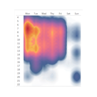
 How to use the Strava API to
reveal your running habits.

The Spotify web API and fun
stuff you can do with it using
Python. I have a (most likely
waaay too) ambitious plan on
stuff I want to build around this.
But first thing's first: This is part 1:
how to set up an app and how
to authorize it.

To access
open WHO data:
Use Tableau's built in OData
connector and point it to
ghoapi.azureedge.net/api/. No
authentication required. A lot
of tables... A relationship between
Indicator & IndicatorDimension
on IndicatorCode is a good start.
WHO data
shows that life
expectancy at birth increased by
6 years globally between 2000
and 2019. Amazing! I made a
Tableau visualization for
comparing the development in
different regions.
 Click the
image!
I recently spent some time
digging up Tableau Server usage
data. The amount of data that
Tableau saves on how it is being
used can be a bit overwhelming...
So I figured that a cheat sheet
might come in handy.

Ok, so here I am with a new job;
time to update the resume.
In order to practice what I preach (and because it's fun), I
made an interactive resume in
Tableau. It's embedded below
and also published to
Tableau Public.
 This just saved my life. Or at
least it saved me a lot of manual
work that was promising to be
quite dull. (I didn't just confuse
that with my life, did I?).
Anyway, I put together a cheat
sheet to remember what I did.
I really need to do something about my html and css skills. But the webpage is now live. Eventually I might tell someone about it... Eventually.


was born
and there was much rejoicing
Hover over an item for additional details